Client Overview
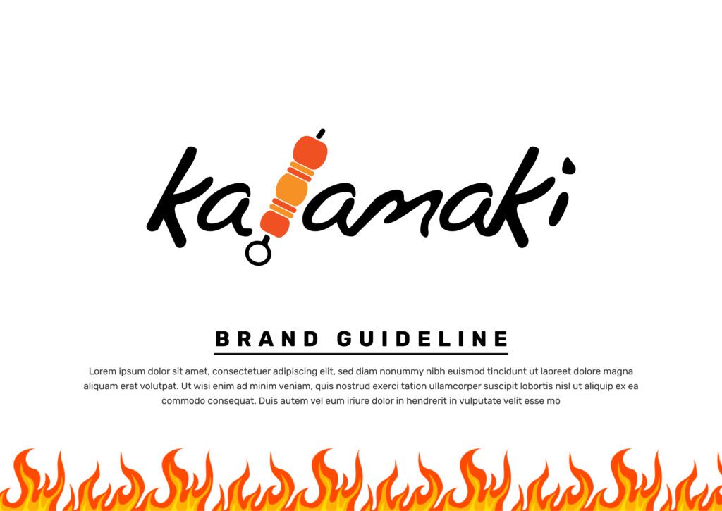
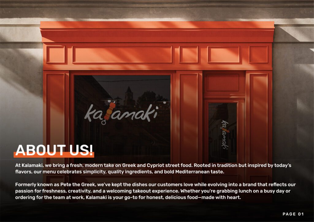
Restaurant: Kalamaki (Formerly Pete the Greek)
Cuisine: Modern Greek & Cypriot Street Food
Location: Urban Location
Business Type: Fast-casual takeout focused restaurant
Target Market: Busy professionals and food enthusiasts seeking fresh, authentic Mediterranean street food
The Challenge
Kalamaki was undergoing a significant transformation from “Pete the Greek” – a traditional Greek restaurant – into a modern, fresh take on Greek and Cypriot street food. This rebrand required a complete visual identity overhaul that would reflect their new positioning while maintaining the essence of what customers loved about their food.
Brand Evolution: Transitioning from a traditional sit-down Greek restaurant identity to a modern, fast-casual street food concept that appeals to today’s busy customers while honoring Mediterranean traditions.
Market Positioning: Needed to compete in the crowded fast-casual market while standing out as an authentic yet contemporary Mediterranean option.
Visual Identity Gap: The old “Pete the Greek” branding was outdated and didn’t reflect the fresh, modern approach to traditional recipes that the restaurant was implementing.
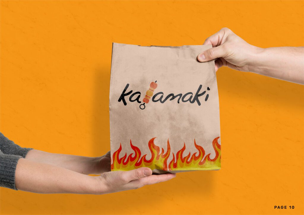
Takeout Focus: Required a brand identity that worked excellently for takeout packaging, delivery services, and quick-service environments while maintaining premium appeal.
Our Design Solution
We developed a vibrant, contemporary brand identity system that celebrates the bold flavors and fresh approach of modern Mediterranean street food while honoring authentic Greek and Cypriot culinary traditions.
Brand Story: “Fresh, modern take on Greek and Cypriot street food – rooted in tradition but inspired by today’s flavors”
Brand Values:
Target Audience: Urban professionals, food enthusiasts, and anyone seeking quick, high-quality Mediterranean meals that don’t compromise on authenticity or taste.
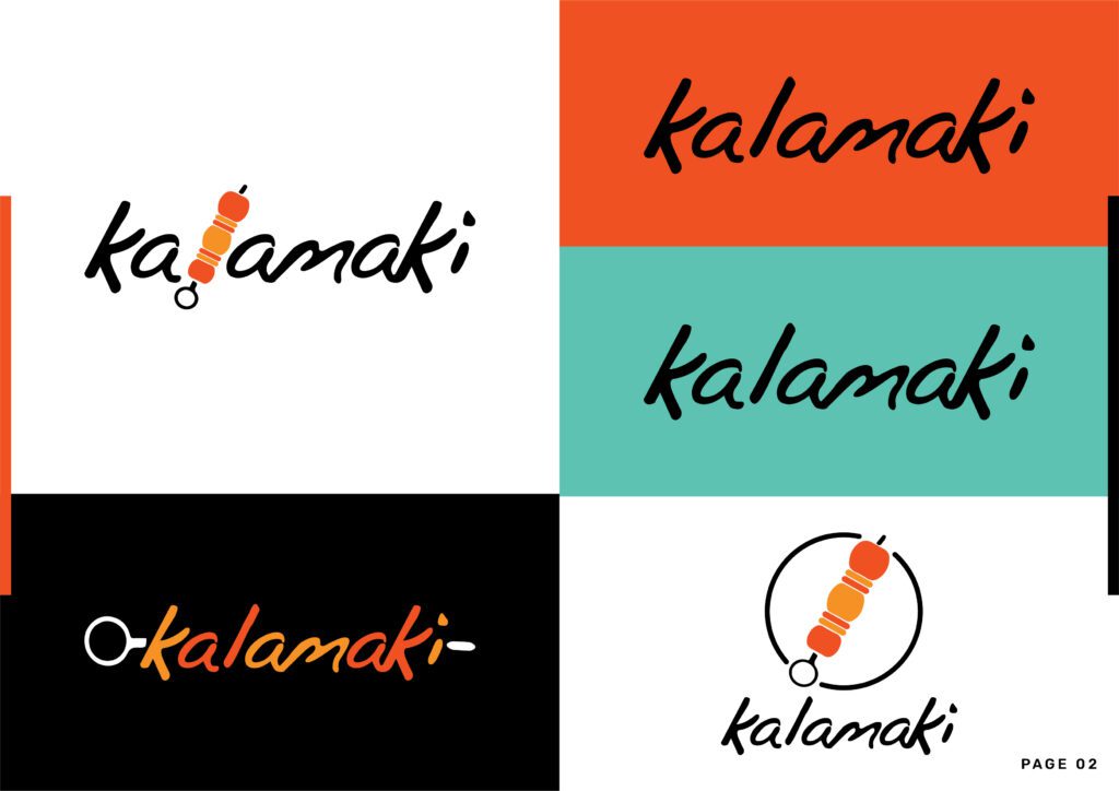
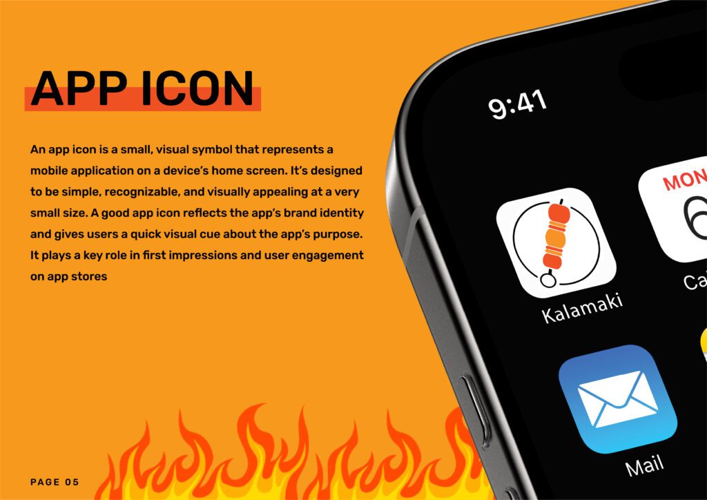
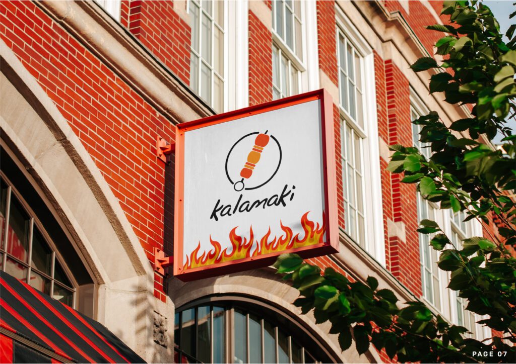
Logo Concept: The Kalamaki logo features a modern, clean design that balances contemporary aesthetics with Mediterranean warmth. The mark is designed to work effectively across all applications from app icons to large-scale signage.
Typography System:
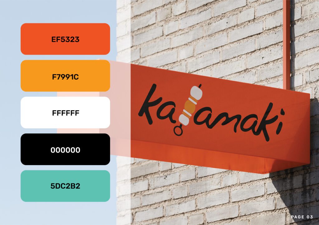
Brand Colors:
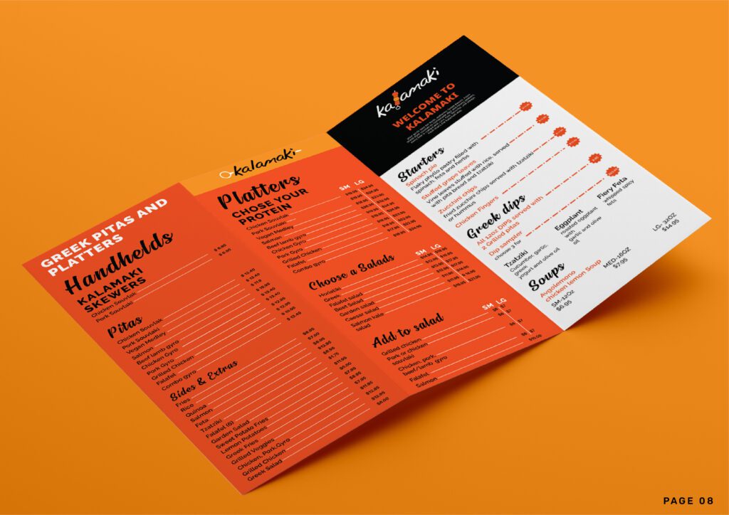
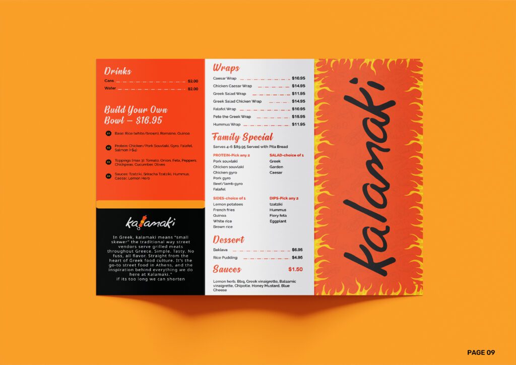
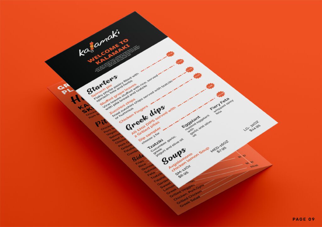
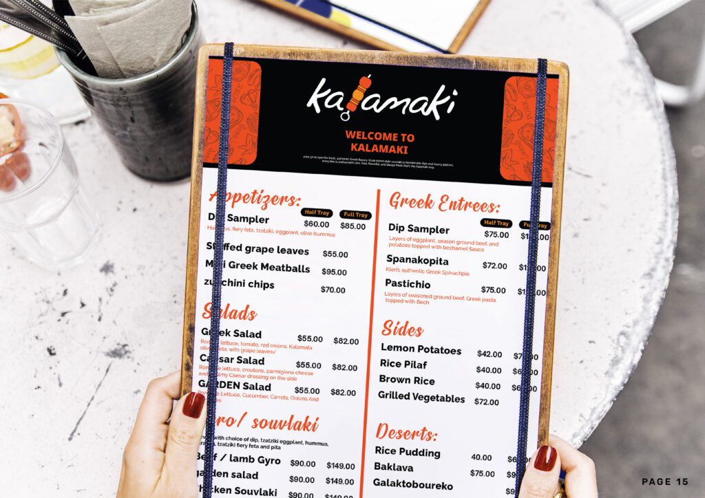
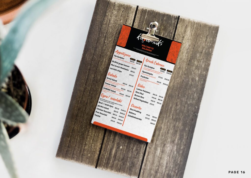
Design Concept: Clean, modern menu design that makes ordering easy and highlights the fresh, street food approach while maintaining Mediterranean authenticity.
Menu Structure:
Street Food Focus:
Design Features:
“Taste of Modern Greece” Marketing Series:
1. Grand Opening Postcard:
2. Catering Services Postcard:
3. Lunch Specials Postcard:
4. App Launch Postcard:
5. Loyalty Program Postcard:
“The Kalamaki Story” Brochure:
Cover Design:
Inside Content:
Design Elements:
Complete Brand Standards Document:
Section 1: Brand Identity Overview
Section 2: Logo Usage Standards
Section 3: Color System
Section 4: Typography Guidelines
Section 5: Visual Language
Section 6: Application Standards
Brand Transformation Success
Business Impact
Marketing Effectiveness
Operational Benefits
“The rebrand from Pete the Greek to Kalamaki was exactly what we needed to reflect who we’ve become. The new identity captures our fresh, modern approach while still honoring our Greek and Cypriot heritage. The orange and yellow colors are vibrant and energetic – just like our food. Our customers love the clean, contemporary look, and we’ve seen a significant increase in younger customers who are drawn to the modern aesthetic. The brand guidelines have made it so easy for us to create consistent marketing materials, and everything from our app icon to our catering brochures looks professional and cohesive. This wasn’t just a logo change – it was a complete transformation that positioned us perfectly in the fast-casual market.”
– Restaurant Owner, Kalamaki
Core Brand Identity
✓ Primary logo with modern, clean aesthetic
✓ App icon optimized for mobile applications
✓ Vibrant color palette (#EF5323, #F7991C, #FFFFFF, #000000)
✓ Rubik typography system implementation
✓ Brand pattern and visual language development
Menu Card Design
✓ Modern, scannable menu layout optimized for quick service
✓ Clear categorization using brand typography and colors
✓ Digital-friendly format for app and online ordering
✓ Takeout-focused design with easy-to-read descriptions
Marketing Postcards
✓ 5-piece promotional postcard series
✓ Grand opening, catering, lunch specials, app launch, loyalty program
✓ Consistent brand application across all pieces
✓ QR code integration for digital connectivity
Restaurant Brochure
✓ Professional tri-fold brochure telling the brand evolution story
✓ Modern food photography showcasing street food concept
✓ Catering and service information clearly presented
✓ Brand-consistent design using Rubik typography and color palette
Brand Guidelines Manual
✓ Comprehensive brand standards document
✓ Logo usage and typography specifications
✓ Color system with exact codes and applications
✓ Marketing template guidelines
✓ Digital and print application standards
Additional Brand Applications
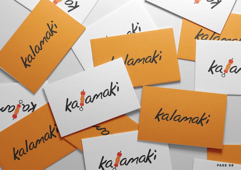
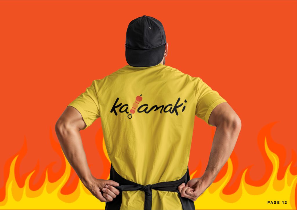
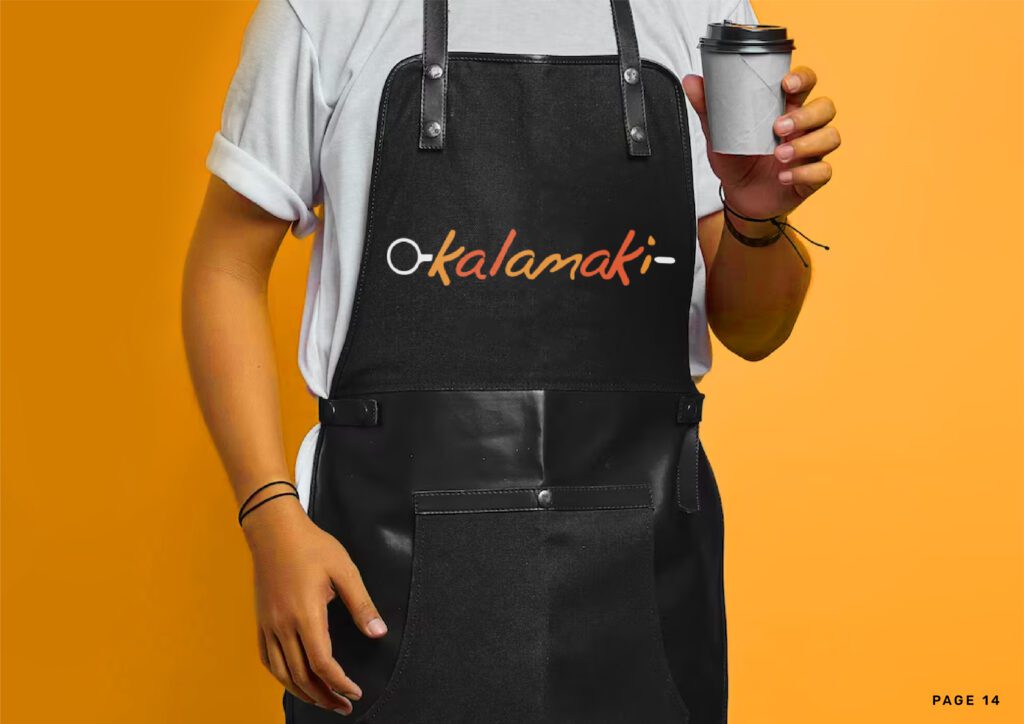
✓ Business card designs with modern aesthetic
✓ Social media templates using brand colors and fonts
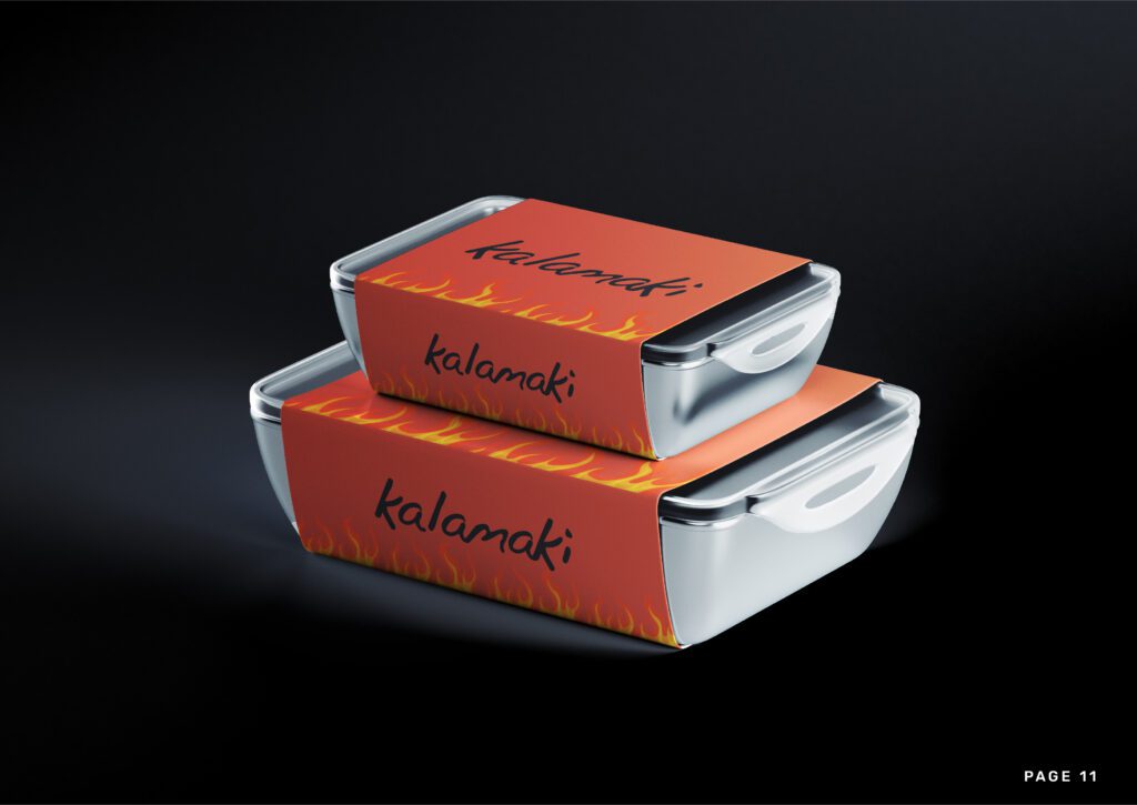
✓ Packaging design guidelines for takeout containers
✓ App interface design specifications
✓ Signage design standards for storefront applications
Ready to transform your restaurant brand with modern, vibrant identity design? Contact us today to discuss how strategic rebranding can reposition your business and attract your ideal customers in today’s competitive market.